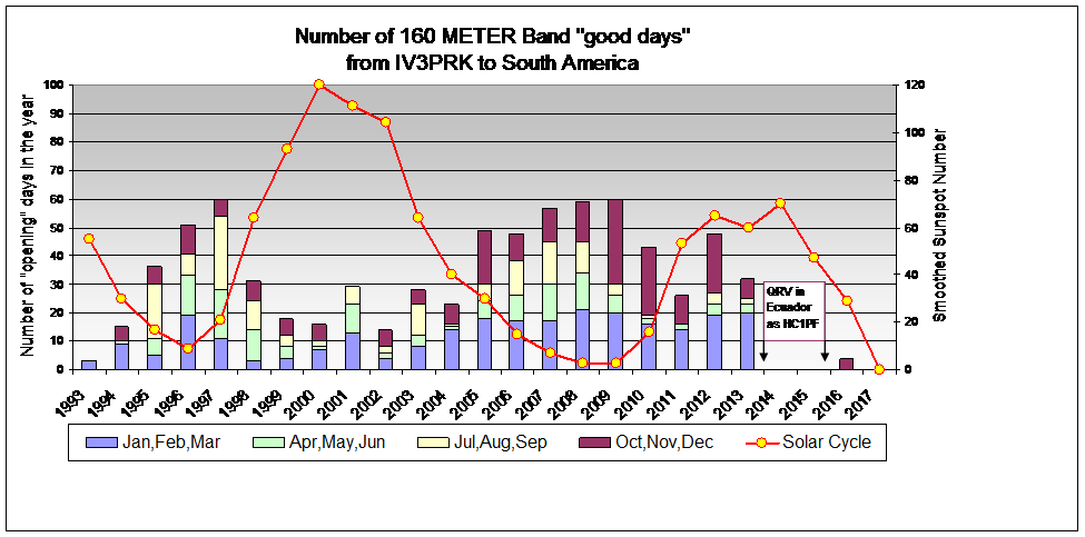
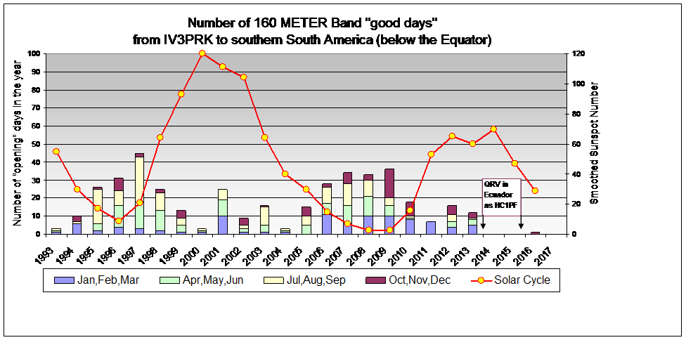
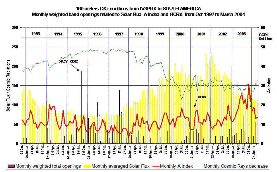
The first graphs are extracted from my daily rating system. See full explanations on this page.
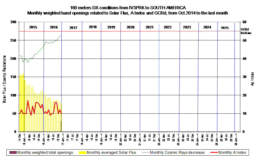
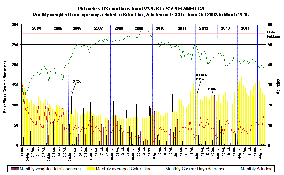
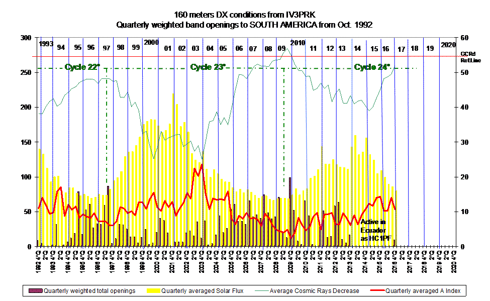
On the next graph the same data are grouped with 3 months media and give a better imagine through the solar cycles.
The following graphs are extracted from a data base with the peaking time of the opening and the sunrise on the eastern point of the path.
See the peaking time graphs here.
Only one time for each day (and one row) and thus are counted the number of days with an opening, weak or strong, no difference on weighting
The graph of “whole” South America is influenced by the contest season’s activities in PJ and P4, so in the last one I extracted only the southern part of the continent.
